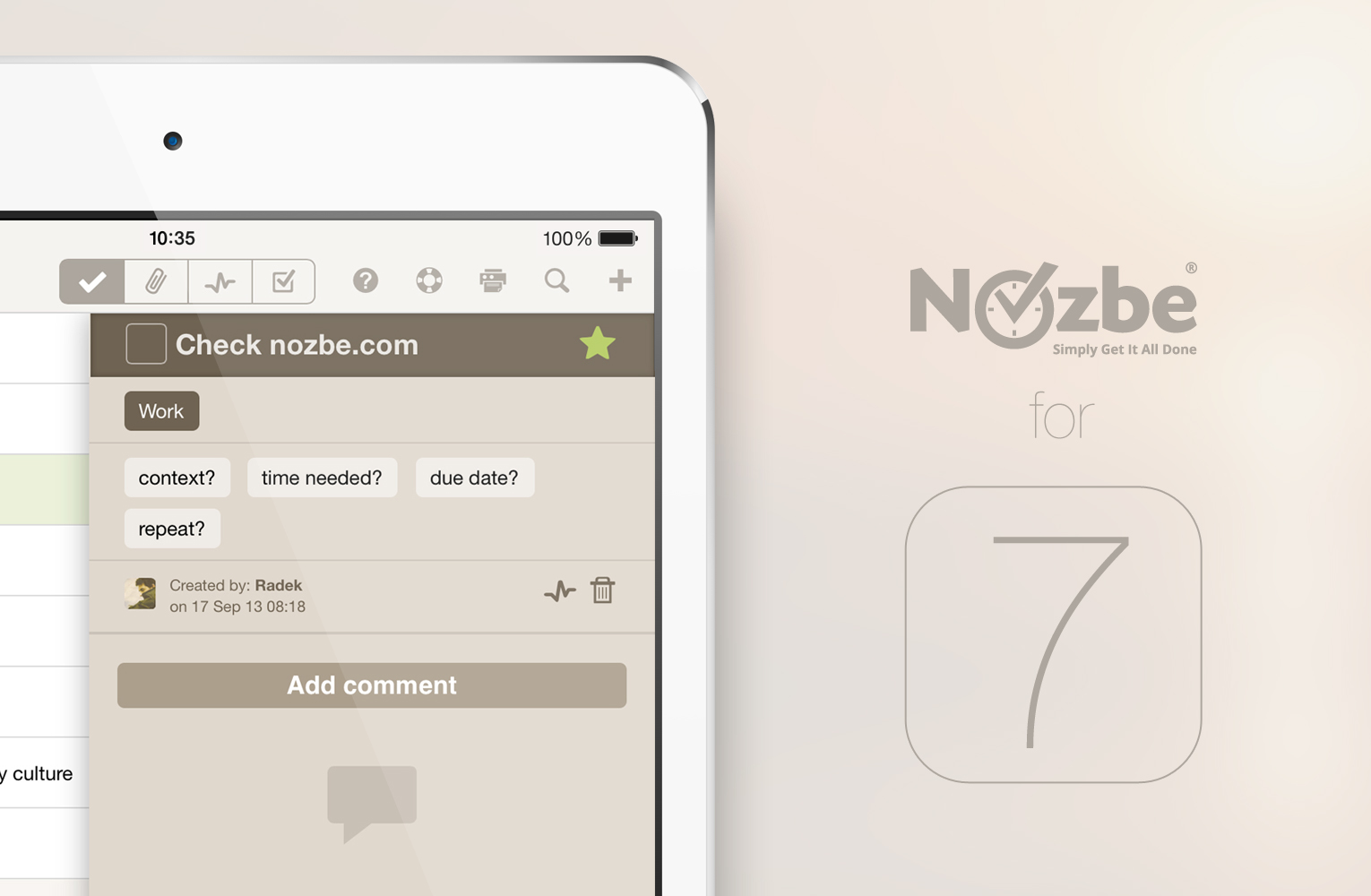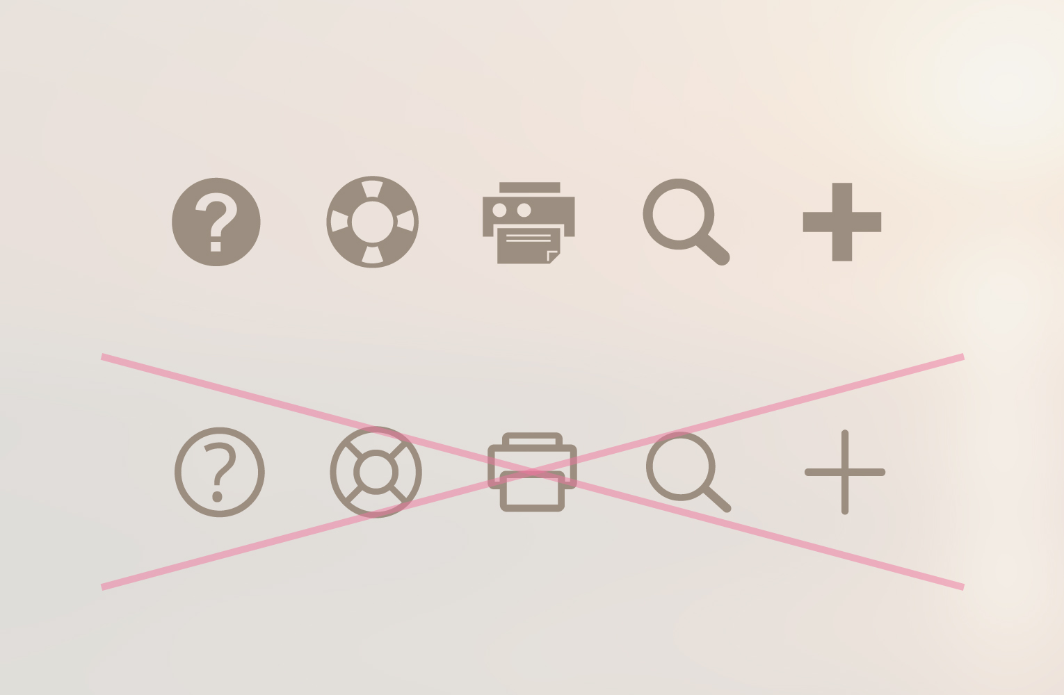
As you probably noticed, Nozbe on iOS7 went through some visual changes. We decided to refresh Nozbe looks, add a bit of lightness, clarity and refresh the Nozbe icon. In the near future we plan to redefine the colors of our app slightly. We are not saying here about drastic changes, but we want Nozbe to be modern not only technologically, but also visually attractive. Just take a look…
What’s more, we introduced other changes in order to match the style of iOS 7. You can see we gave up on heavy gradients for rather solid colors. What’s more, previously black status bar now received the color of our application. It gives the impression of much lighter interface from the one you used to see on iOS 6.
We liked the new, more open approach towards the elements of user interface. However, bearing in mind we support many platforms, we want our users to have great experience no matter what system they use. Although we used some of the design language of iOS7 our app looks the same across all the platforms and devices.
As always, we want Nozbe to be simpler, but at the same time functional and, most importantly, unified. Our aim is to give you the impression of working on the same app all the time. This has been the new direction we are taking right now. You’ll have the same great experience of getting your things done across your favorite systems and devices. You won’t even notice you switch from desktop (whether it’s Mac or PC) to the mobile app.
We’ll take it to the next level with Nozbe 2.0
This is just the first step. We’re currently working on a new Nozbe 2.0 application - more responsive, more unified, faster and sleeker all around - and it will take our new design language to an even higher level. Nozbe 2.0 comes in Spring of 2014 to a device near you :-)
Hope this post gives you more insights to the way we work. Our designer Radek is pouring his heart and soul into this and sweating the details. We think the results are already astonishing and we keep improving! More details soon…


