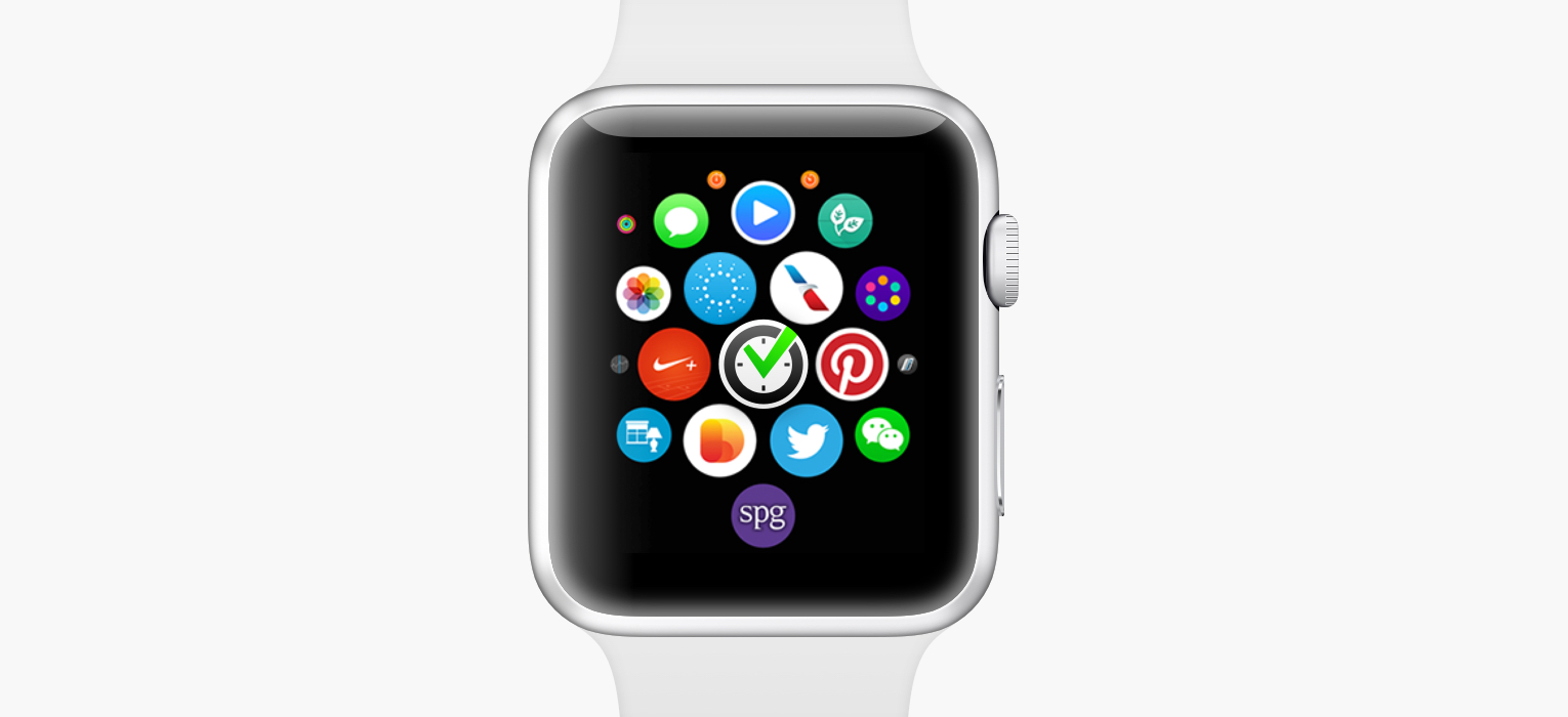
Today, April 24 2015, a very exciting new product hit the market — the Apple Watch. We’ve already announced that we were working on a version of Nozbe for the Watch, but we’ve never really said when we were going to release it. The answer is: we already have.
That’s right. If you have your Apple Watch tethered with your iPhone, all you have to do is update the Nozbe app to 2.1.5 and it will show up on your watch. There’s no step two!
Anyway, I wanted to show you what Nozbe for Apple Watch can do and walk you through the design process behind our app.
Starting point
On virtually every other platform, we would start by designing an app from, well… the app itself. We would design its screens, decide what it should do… it’s so obvious it doesn’t even need to be said.
The Watch is different. It’s a tiny device on your wrist. You’re rarely ever going to hold it in front of you and play with it for more than a few seconds. It’s simply uncomfortable to hold up your wrist for long. And, almost surely, there’s already a far more powerful and capable device in your pocket. It’s a simple equation: if you want to do something that takes more than a few moments, you’ll naturally reach for your phone. Therefore, when designing for Apple Watch, we focused and optimized for the shortest of interactions.
And there’s nothing more immediate than notifications.
Notifications
On iOS, notifications are generally quite dumb. You get the app name, its icon, and a line or two of text. That’s about it.
Apple Watch allows for much richer, more dynamic and more interactive notifications. Here’s what we came up with:
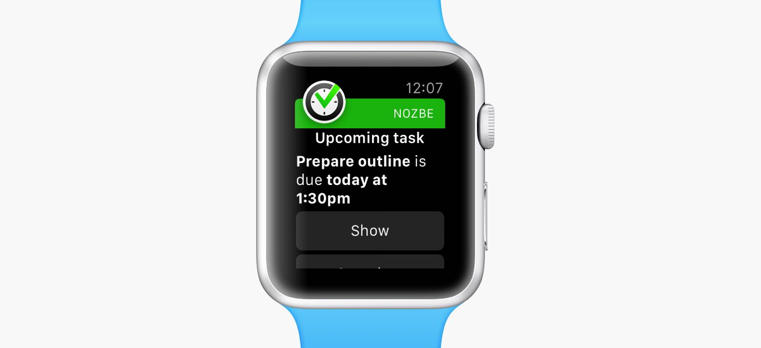
First off, we can customize how the notification text is displayed. When you get an invitation to a project, the notification header says “Invitation”. When you get mentioned in a comment, you see “Mention”. You don’t need to read the whole thing to understand what it’s about. The key words, like project, task or person names are highlighted. Those are small changes, but help you instantly digest the notification.
The second part is far more important and interesting:
Actions
Traditionally, when you get invited to a project, for instance, you had to tap on the notification, wait for the app to load, and only then accept or decline the invite. That’s not fast enough for your wrist. On the Apple Watch, you can just scroll down on the notification and tap one of the action buttons.
In this way, notifications on Apple Watch are much more than just about letting you know that something is happening. They allow you to instantly respond to what’s going on.
Here’s another type of notification: at-mention. It’s when someone mentions your name in a comment, preceded by the “@” sign (e.g. “@John”). There are two actions you can take: you can Show the task where you’re mentioned, or you can Make Priority — add that task to your priority list so that you remember to deal with it later.
One more scenario. Imagine you have a task scheduled for today. You get it done, but you forget to update it in Nozbe. When you get notified about an upcoming task, you can simply tap Complete to mark it as done. No need to open the full-blown app.
(Fun fact: we liked those instant responses so much that we also added them on iOS. When you get a notification on your lock screen, just swipe to the left to reveal them. And if you get notified while using your device, swipe down.)
Glance
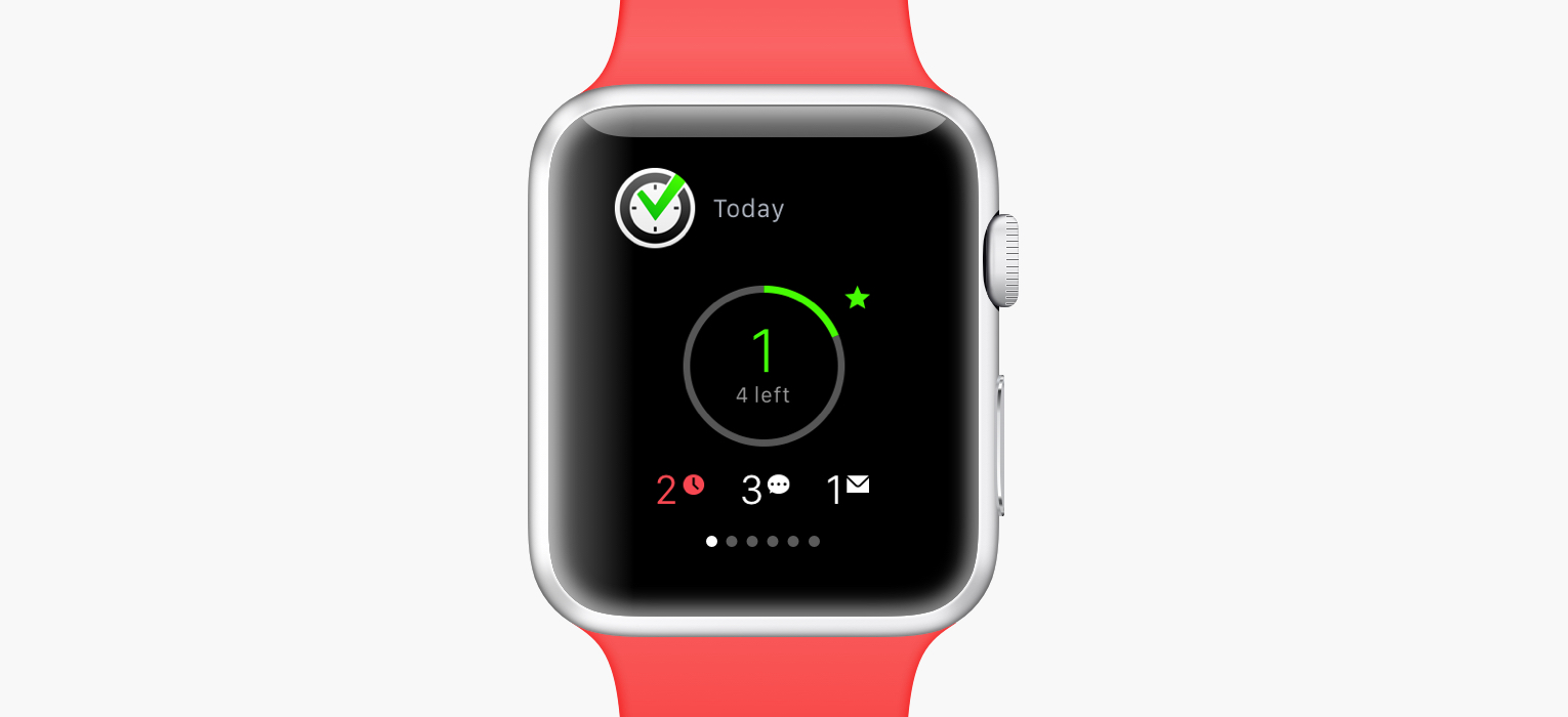
Glances are one-page summaries of apps — and your digital life. You can access them from anywhere on the Watch. Just swipe up from the watch face. You can see there your physical activity, your calendar, the weather… and your tasks.
The Nozbe glance gives you a quick overview of what’s done today and what’s ahead of you.
The circle at the center shows you how many priority tasks that you’ve completed today. The more you get done, the closer you get to a full green circle. In this way, you get an instant sense of how you’re doing today.
Below, there are additional stats you might want to know. If you have overdue tasks, you’ll see the number of them in red. If there are unread comments, or pending invitations, you’ll see them too.
The Watch App Itself
And then there’s the actual app. I mention it last, because you’ll probably use it far less often than notifications and glances.
When designing Nozbe for Apple Watch, we didn’t try to recreate the whole Nozbe experience. It just doesn’t make any sense. No one’s going to manage their projects or categories on their wrist. Why would they, if they can just reach for their phone? Not only would 99% of functionality go unused, but also it would make the app on such a small display extremely bloated and difficult to use.
That’s why we only included the small subset of key functionality in our Watch app:
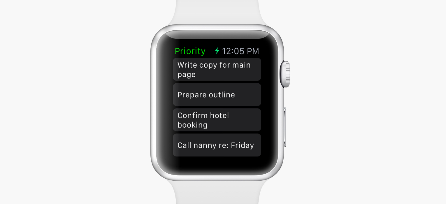
We focused on Priority tasks
When you open Nozbe for Apple Watch you see your priority tasks.
Imagine you’re running errands or doing shopping. When you’re putting groceries in your basket, or walking into the subway, or in other similar contexts, reaching for your phone to see your tasks is quite inconvenient (unless your have three arms).
With the Watch you can just mark the right tasks as priority so they show up on your wrist.
You can tap them to see their details. Often, you might have important notes in the comments, or you might want to know what time the task is supposed to get done.
May the Force Touch be with you
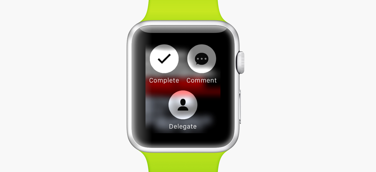
So you do your groceries, run your errands, what’s next? When you press firmly on the screen, a few options show up. Again, we didn’t try to replicate everything Nozbe can do, only the things you’ll want to do most often on your wrist.
You can Complete, Delegate and Comment on the task.
The first one is the most obvious. You get something done, you complete the task. The second one is very related. Often, you’re only doing a part of the task, and then you want to delegate it back to someone else.
The third option requires a screenshot to explain:
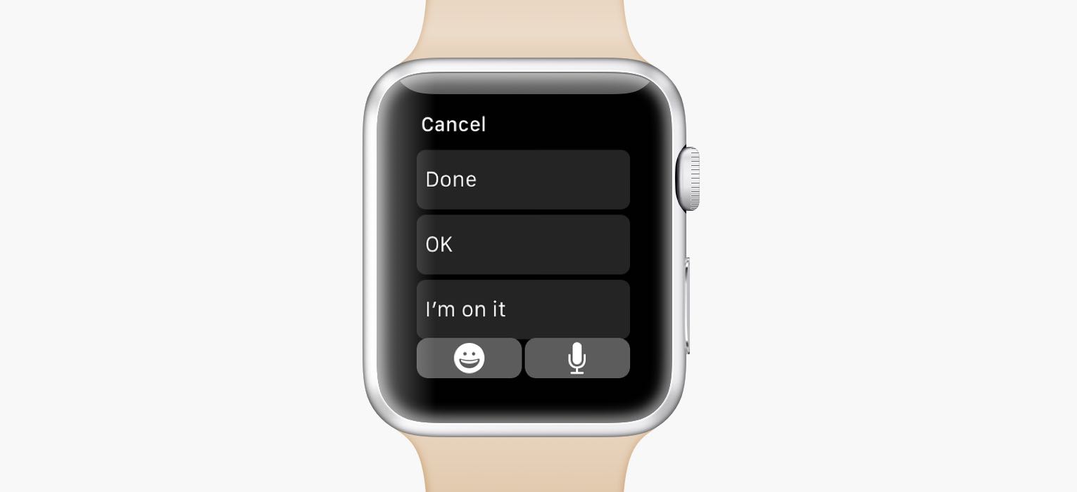
You can tap the button in the bottom right corner to start dictating a comment. But often times, you just want to say “Done” before completing a task, so that your coworkers know you completed it. Or when someone delegates an urgent task to you, you can comment “I’m on it” to quickly acknowledge it.
Force touch to add a task:
There’s one more action, and it’s on the priority list. When you press firmly on the screen, you can add a task to your inbox. Useful for quick notes.
Handoff
A few months ago, we introduced a feature called Handoff. It allows you to quickly move between devices. So when you’re using Nozbe on your Mac and you want to leave your desk, you can instantly hand off to your iPhone, without losing your place in the app.
I’m happy to say that Nozbe for Apple Watch also supports Handoff. It’s a tiny little feature, but it makes the watch way more useful. For example, you’re looking a task and want to reply to it, you don’t have to speak to your wrist, or have to unlock your phone, find Nozbe, find the project, find the task… No, just swipe up on the Nozbe icon from your lock screen, and you’ll be looking at the same task as on your wrist. The same thing works when you get a notification about a task.
This is just the beginning…
What you’re seeing is just the 1.0 version, made in an amazingly short time. We already have a bunch of improvements in the pipeline, and many more ideas to explore. What’s more, the kinds of apps 3rd parties can make for the Apple Watch are quite limited at the moment. There are many possibilities yet to be uncovered.
In the meantime, we can’t wait to get our hands on Apple Watches (and Apple Watches on our hands!) and we can’t wait to hear your feedback! Leave a comment below and tell us what you think.
You can download Nozbe with Apple Watch support on App Store.
written by Radek, VP Apple Technologies


