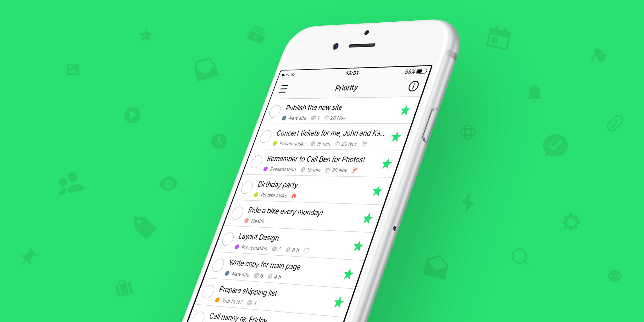
The big day is coming. We are putting finishing touches to Nozbe 3.0 and cannot wait to share it with our great Nozbe users. We hope this will be the best gift for you to celebrate our 9th birthday :) And your feedback will be the best gift for us!
Today, we wanted to share some highlights from Nozbe 3.0:
New logo
It was back in August 2015 when our designer Hubert prepared a blogpost on our internal blog with a project of a new Nozbe logo. When Michael saw it he got a bit mad… because he realised how much he liked the new logo and that the change was necessary ;) I mean seriously! The new logo is so beautiful that Hubert was crying with tears of joy while drawing it. True story! ;)
New task details column
The new logo is the icing on the cake of a new design. With Nozbe 2.5 and 2.6 we introduced some major changes to the app design. We brought a new font, new colors, new icons, refreshed side panels and task list appearance. The last part of the app that needed a redesign was the task details column. That is kind of a place when the magic happens. In this view, you comment tasks, delegate them and complete them. You simply get everything done over there. First attempts to tweak the task details design were made in April 2015 but we could not agree on how it should look like. After months of discussions and tons of sketches we finally got to the solution which, although not so revolutionary, really improves the user experience.

