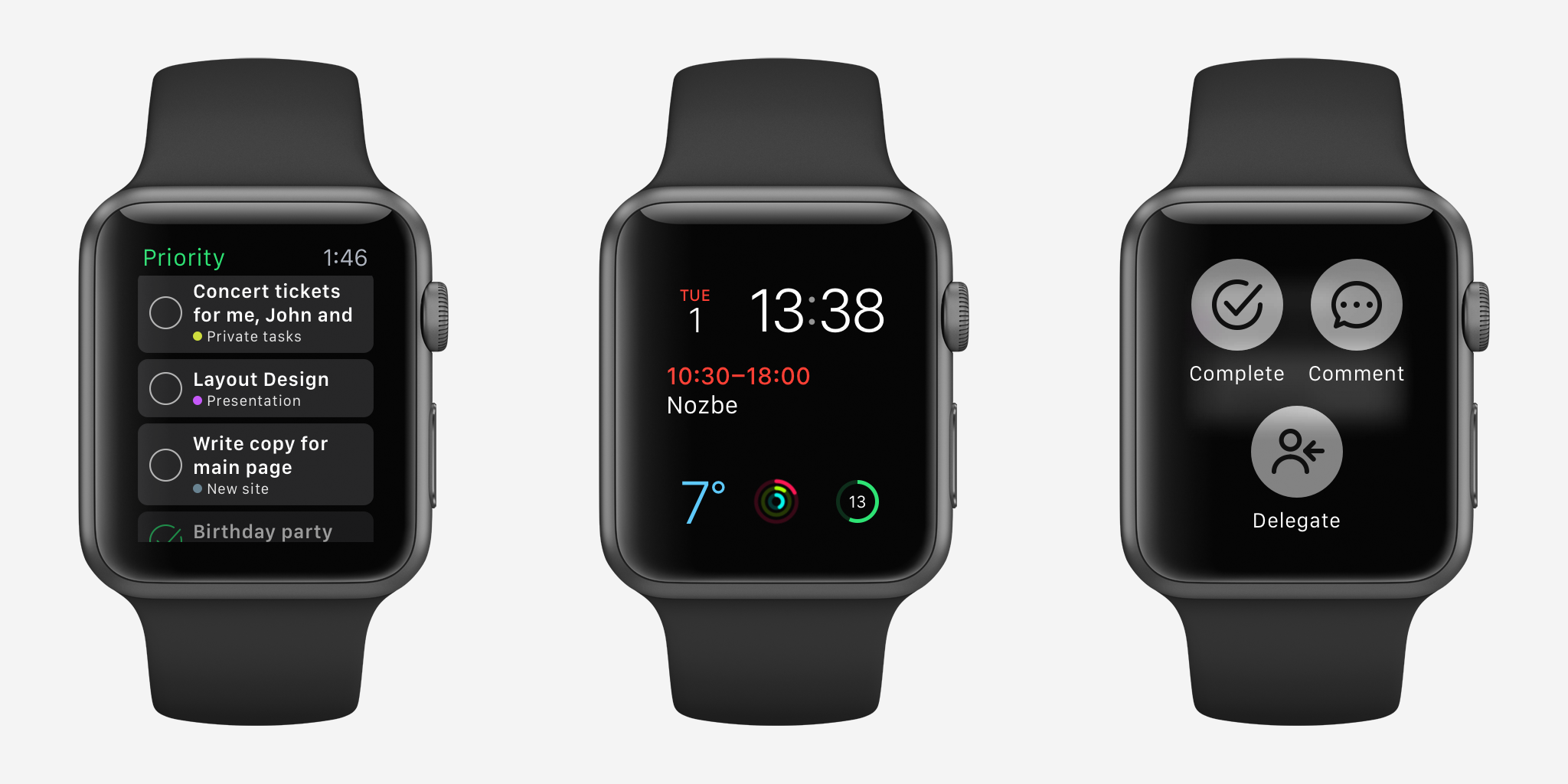
Regarding Nozbe 2.5 for iOS and Apple Watch
3 December 2015
Nozbe 2.5 with new design, Android quick add, 3D Touch shortcuts for iOS and WatchOS 2 app
16 November 2015
Nozbe 2.2 with Google Drive and Mac widget
10 August 2015
The Second Coming of Nozbe for Apple Watch
16 July 2015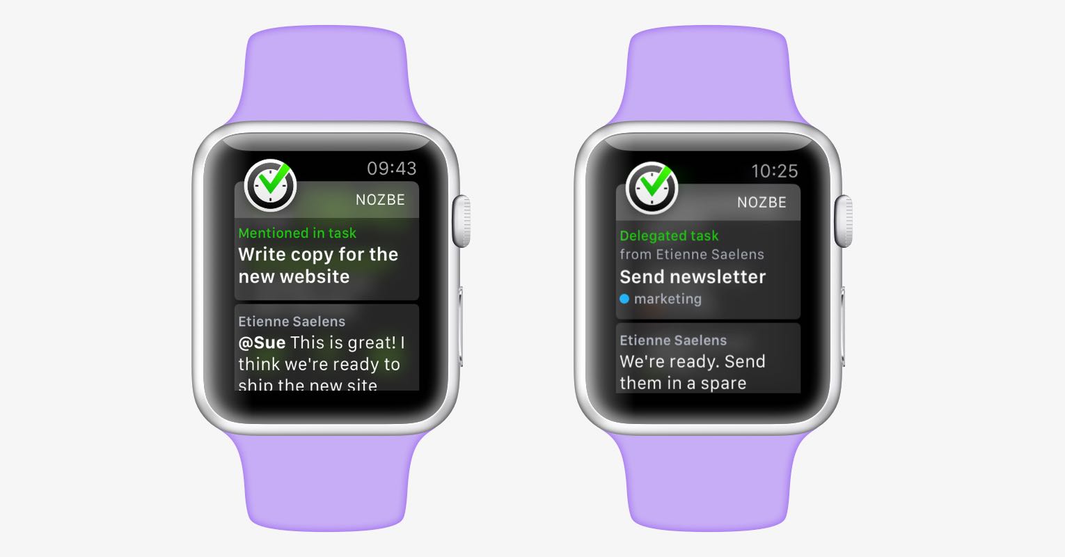
It’s been just over two months since we’ve released Nozbe for Apple Watch. (I’ve written more about it in a previous blog post.) At the time, Apple Watch hasn’t yet hit the market, so we couldn’t test it directly on the device. Since then, we got a few watches for ourselves. We learned a lot about this device, its strengths and weaknesses. And after using our own app extensively, we saw a huge area for improvement. Today, I’m happy to announce that the latest version of Nozbe includes a lot of improvements for the Watch.
If you have an Apple Watch, just update Nozbe on your iPhone to 2.1.8, and the watch app will automatically update as well.
And if you’re curious about what’s new, keep reading!
(at the end of this post there’s a cool video we recorded that showcases everything in this post, make sure not to miss it!)
Supercharged notifications
As I explained in the previous post, we started our development with notifications, because they’re the most common and most immediate interaction with the Apple Watch. You don’t really have to do anything, they simply show up when appropriate, and they allow you to respond instantly.
In that spirit, and with what we’ve learned, we redesigned notifications to make them look beautiful and much more useful. Take a look:
Before, when you were mentioned in a comment, the notification would only tell you who mentioned you, and in what task. But to actually see the comment, you would have to tap “Show task” and wait for the app to load. Now, we simply show you the comment right in the notification. And if you want to reply immediately, we added a new action under the notification: Comment.
