
The big day is coming. We are putting finishing touches to Nozbe 3.0 and cannot wait to share it with our great Nozbe users. We hope this will be the best gift for you to celebrate our 9th birthday :) And your feedback will be the best gift for us!
Today, we wanted to share some highlights from Nozbe 3.0:
New logo
It was back in August 2015 when our designer Hubert prepared a blogpost on our internal blog with a project of a new Nozbe logo. When Michael saw it he got a bit mad… because he realised how much he liked the new logo and that the change was necessary ;) I mean seriously! The new logo is so beautiful that Hubert was crying with tears of joy while drawing it. True story! ;)
New task details column
The new logo is the icing on the cake of a new design. With Nozbe 2.5 and 2.6 we introduced some major changes to the app design. We brought a new font, new colors, new icons, refreshed side panels and task list appearance. The last part of the app that needed a redesign was the task details column. That is kind of a place when the magic happens. In this view, you comment tasks, delegate them and complete them. You simply get everything done over there. First attempts to tweak the task details design were made in April 2015 but we could not agree on how it should look like. After months of discussions and tons of sketches we finally got to the solution which, although not so revolutionary, really improves the user experience.
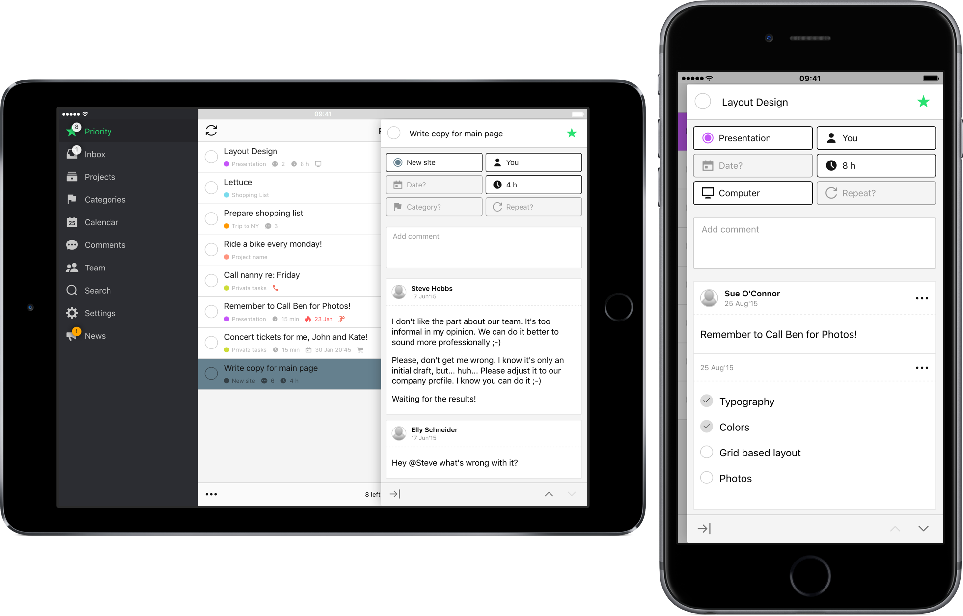
- Task details section in Nozbe 3.0 is wider for better experience while reading and writing comments
- Parameters buttons have fixed position to allow you to set them as quickly as possible
- We added buttons to quickly jump to previous/next task. Delightful when doing a weekly review or catching up on new comments.
Project and team roles
The real power of Nozbe is within its collaboration capabilities. With Nozbe 3.0 we will introduce Business accounts to make using Nozbe in larger teams more productive. First of all, Team Owner will be called Team Admin. He or she will be able to nominate another team member to be a Team Admin as well. This makes managing larger teams a lot easier. Nozbe PRO users will get 1 additional Admin. Nozbe Business will have unlimited number of Admins.
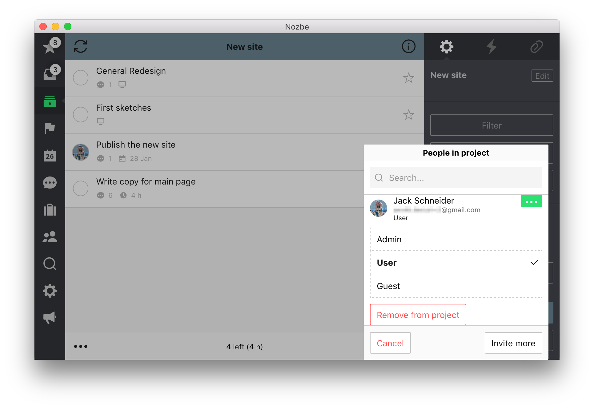
We are also bringing project roles into Nozbe 3.0:
- Project Owner is now called Project Admin — You can now have multiple people be able to invite members of your team to the project or complete it.
- Project Guest can only access the project and comment or complete tasks delegated to them (this role is ideal when you wish to invite a client to your project)
- Nozbe PRO users can have 2 Project Admins and 1 Guest per project.
iPhone keyboard assistant
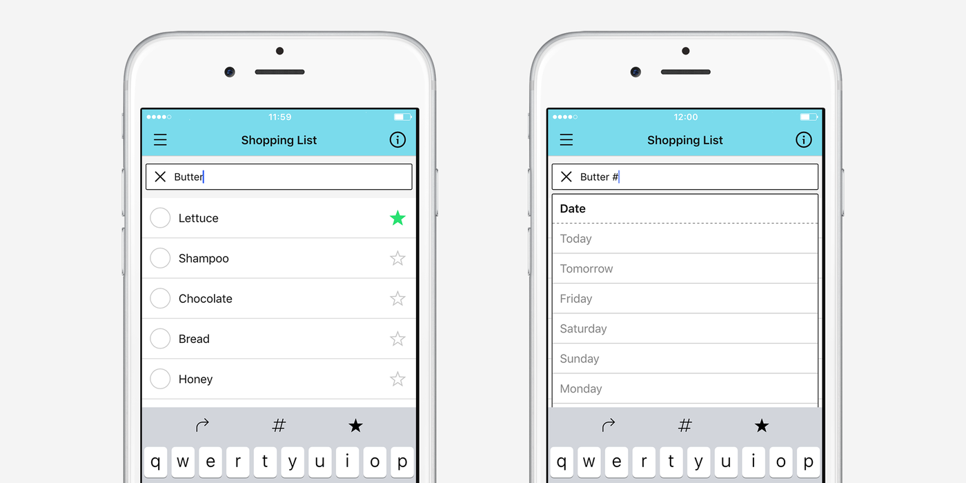
Nozbe on iPhone has a new cool feature we call the keyboard assistant. When typing in a new tasks, you’ll see 3 new buttons above the keyboard:
- Direction arrow. Usually, tasks are added to the top of the list in Nozbe. However, sometimes you might want to append them to the bottom, for example, when noting low-priority items, or when you start a new project and want to enter multiple tasks from top to bottom.
- Hashtag key. When adding new tasks, you can use the hashtag notation to mark them with extra parameters. For example, “Review this project #tomorrow #every week” will make the task due tomorrow, then repeating every week. This isn’t a new feature, but the “#” key is now instantly reachable. (We also made a number of improvements to the hashtag suggestion list.)
- Priority switch. You can now mark a new task as a priority from any place in the app without leaving the keyboard area. Before, you would have to add the task, open it, and then mark it as a priority. (Or you would have to know about the secret “#!” hashtag parameter :)) Now, just tap the star before pressing the return/Next button, and whatever it is you’re creating, it’s a priority!
More powerful iOS share extension
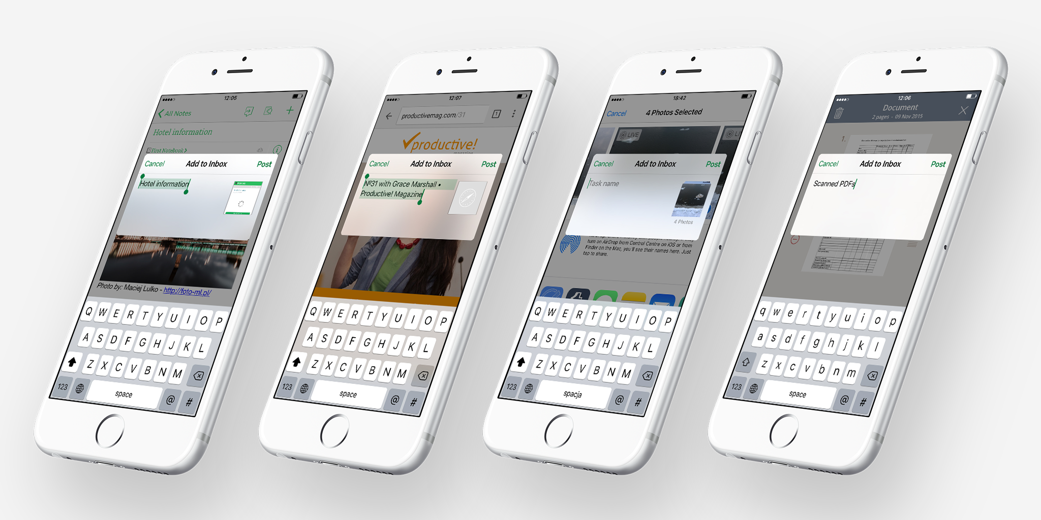
When iOS 8 was released in late 2014, we added a feature called “share extension” to Nozbe. Using it, you could easily add stuff from your device to your Inbox with the system share sheet.
The only problem was that it was limited to a single shared item and didn’t work in many popular apps, such as Evernote or Chrome. No longer. In Nozbe 3.0, the share extension should work with just about any app, and you can share as much stuff as you want. (For instance, you can add multiple screenshots from Photos at once.)
Pro-Tip: Use the hashtag notation to add attributes to the task with shared items, for example “Screenshots #marketing #tomorrow #1 h”
iPad keyboard shortcuts
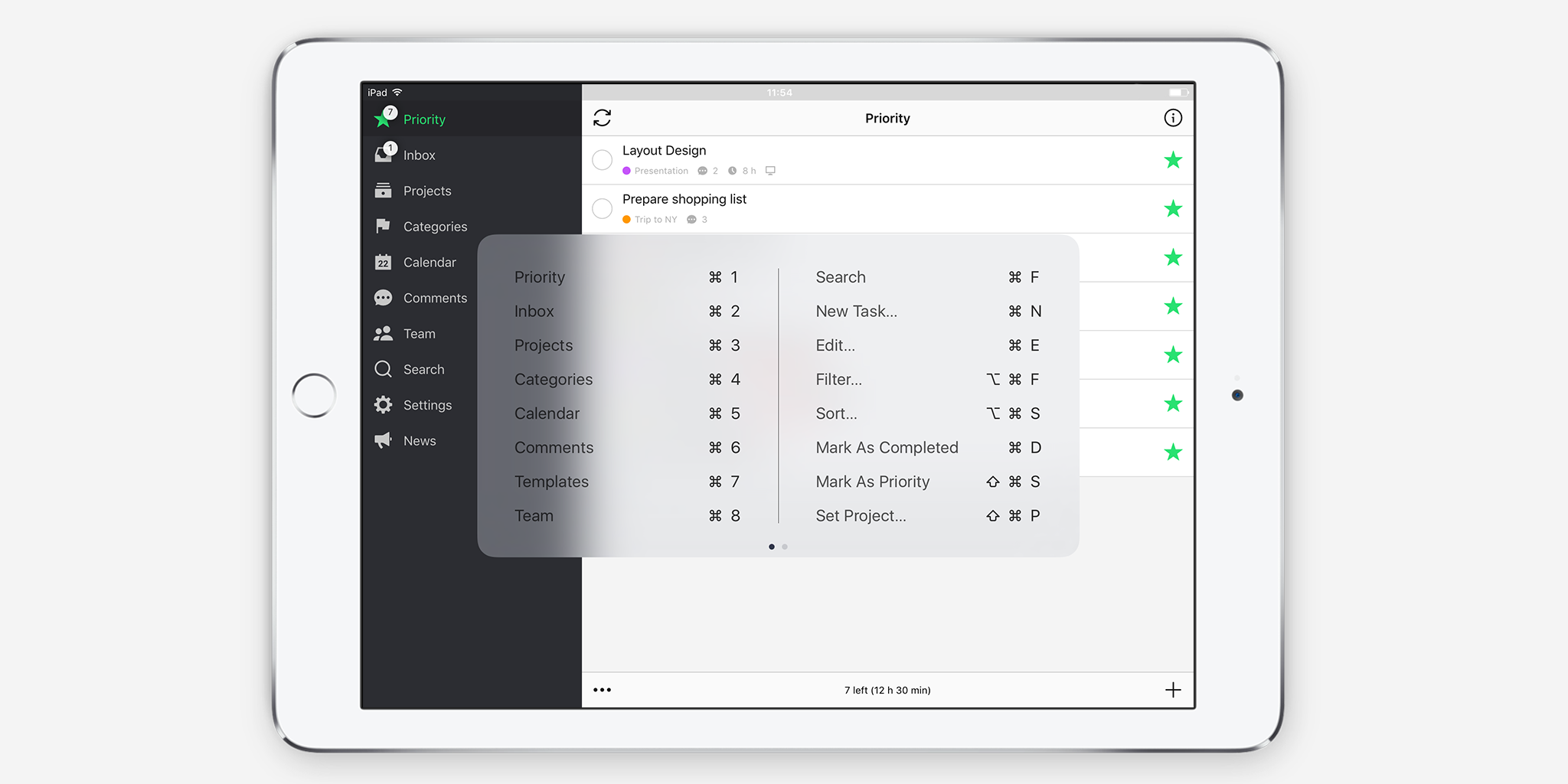
If you’re an iPad geek and use it for work with an external keyboard, good news. The keyboard shortcuts you know and love from our Mac app are now available on iOS as well.
Just press ⌘/Command key on your keyboard to see the list of available shortcuts, then blast away ⌘N’ing tasks, and ⌘⇧W’ing them to your coworkers!
(We also have a new shortcut: ⌘↑/⌘↓ to walk to the previous/next task on the list.)
PS. If you want to help us test the beta version of Nozbe 3.0 and catch any remaining bugs, go to our Test Blog.
written by Rafal, VP Product and Radziu, VP Apple Technologies


