It’s been just over two months since we’ve released Nozbe for Apple Watch. (I’ve written more about it in a previous blog post.) At the time, Apple Watch hasn’t yet hit the market, so we couldn’t test it directly on the device. Since then, we got a few watches for ourselves. We learned a lot about this device, its strengths and weaknesses. And after using our own app extensively, we saw a huge area for improvement. Today, I’m happy to announce that the latest version of Nozbe includes a lot of improvements for the Watch.
If you have an Apple Watch, just update Nozbe on your iPhone to 2.1.8, and the watch app will automatically update as well.
And if you’re curious about what’s new, keep reading!
(at the end of this post there’s a cool video we recorded that showcases everything in this post, make sure not to miss it!)
Supercharged notifications
As I explained in the previous post, we started our development with notifications, because they’re the most common and most immediate interaction with the Apple Watch. You don’t really have to do anything, they simply show up when appropriate, and they allow you to respond instantly.
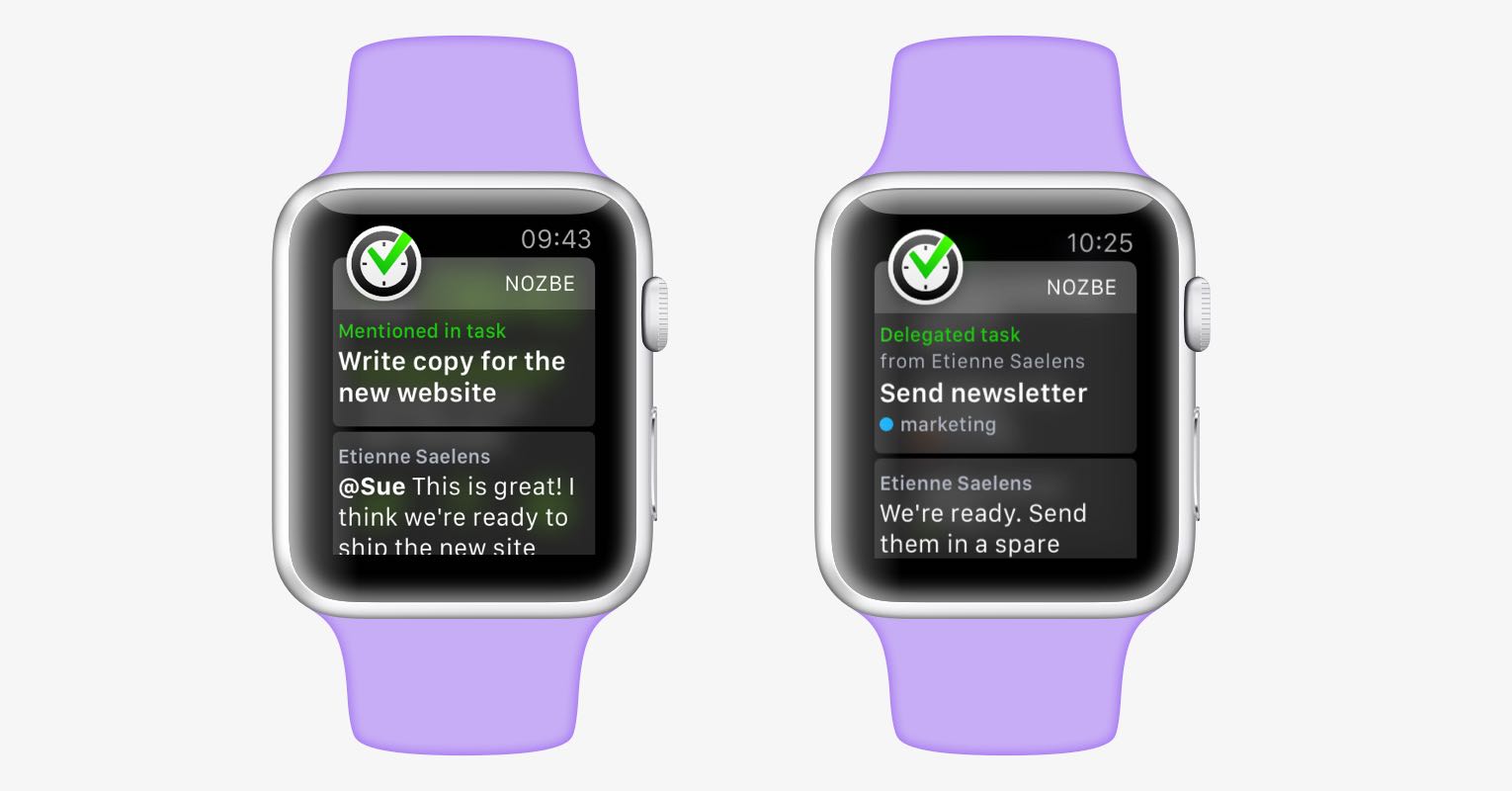
In that spirit, and with what we’ve learned, we redesigned notifications to make them look beautiful and much more useful. Take a look:
Before, when you were mentioned in a comment, the notification would only tell you who mentioned you, and in what task. But to actually see the comment, you would have to tap “Show task” and wait for the app to load. Now, we simply show you the comment right in the notification. And if you want to reply immediately, we added a new action under the notification: Comment.
We improved “delegated task” notifications in a similar fashion. When someone comments on a task to explain its purpose before delegating it to you, we’ll display that comment right in the notification. Like with mentions, we added a shortcut to reply with a comment, and we added another shortcut to delegate the task to someone else (if you decide the task isn’t right for you.) We also added the project name under the delegated task, for more context.
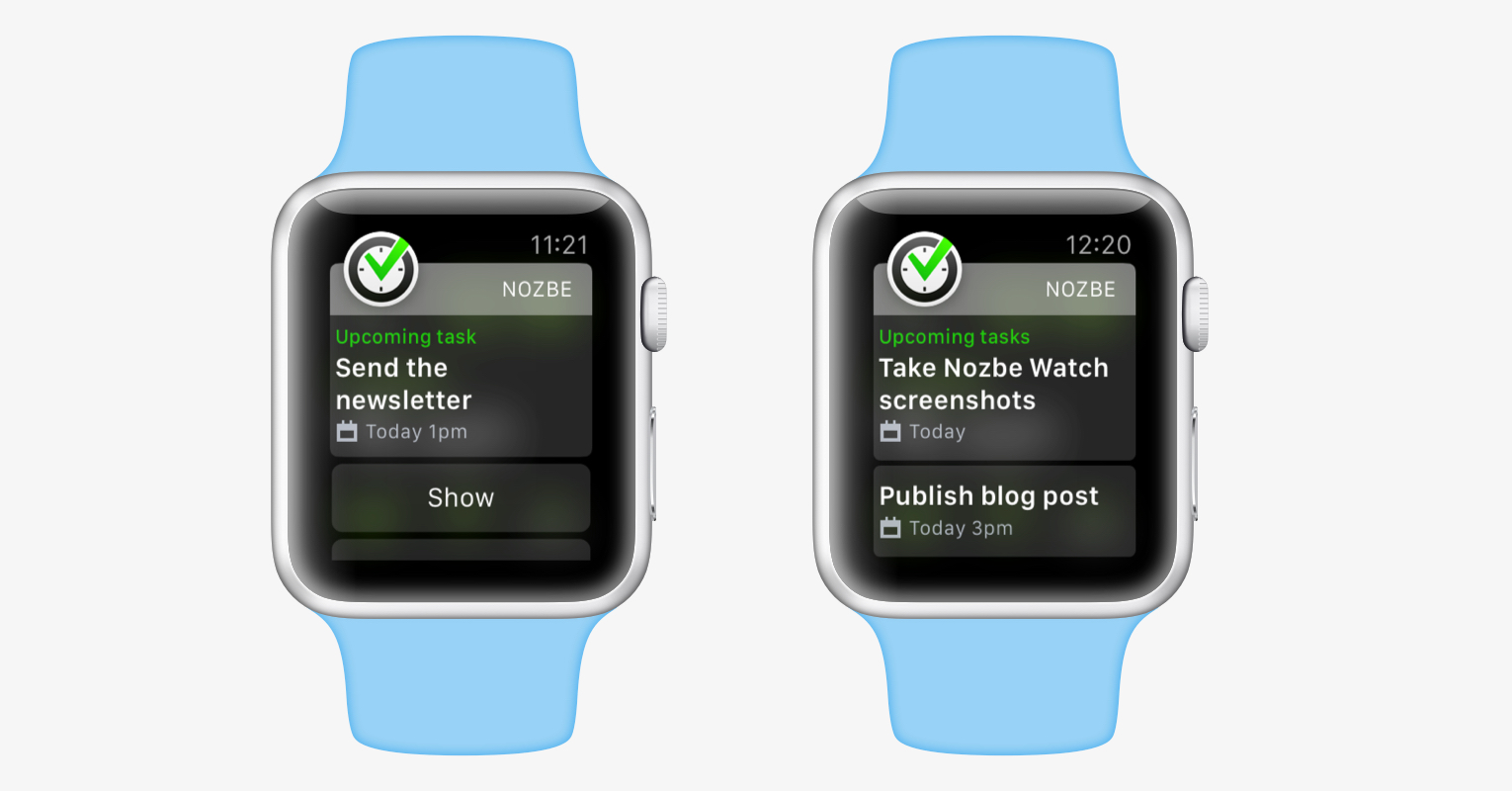
In addition to a fresh, more readable look, upcoming task notifications got a significant upgrade. When you’re notified of multiple upcoming tasks (usually in the 9am notification for tasks scheduled for the day), all upcoming tasks are displayed. This is more helpful than a “5 tasks today” notification, or multiple notifications for each individual task.
Priority list
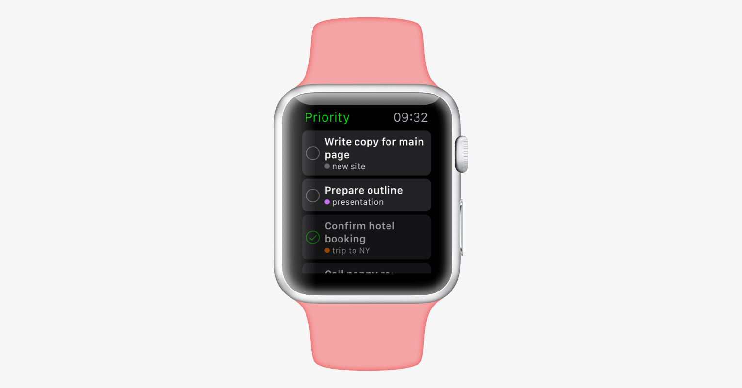
When designing our app, we decided that (at least for now), we’re only going to display your Priority tasks. This is partly for performance, but mostly for focus. You can always reach for your iPhone if you need more detail, but the watch should be a place for your most important tasks, with minimal clutter and complexity.
Perhaps we went one step too far with this approach, though. In the previous version:
- you couldn’t complete tasks quickly on the list
- you couldn’t see the tasks you’ve just completed on the bottom of the list
- we didn’t display project names of the tasks
We fixed all of those problems.
Add priority tasks
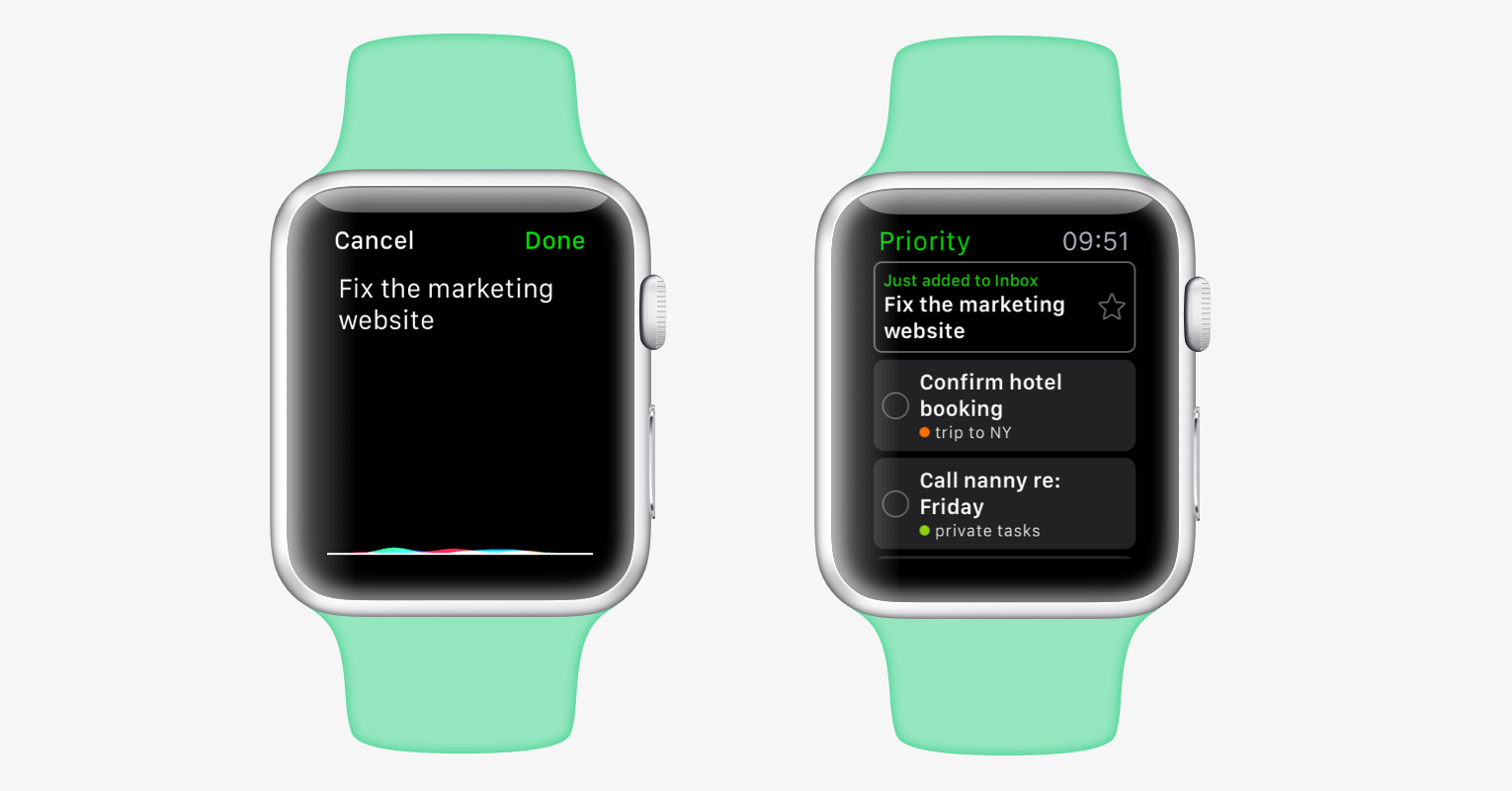
One useful feature of Nozbe on your wrist is the ability to quickly dictate tasks and add them to your inbox.
The problem we’ve encountered with it is that sometimes you want to add tasks immediately to your priority list, not the inbox. On an iPhone, this isn’t a problem, but on the Watch, you can’t see your inbox to make a task priority.
Yep, we fixed this too! When you dictate a task, it’s still added to the inbox by default. But now, a “ghost task” briefly appears on the list to confirm that you added something to your inbox. You can ignore it and it will disappear after a moment. But if you want it in your priority list, you can tap on the star, and boom, the task is now a priority!
Still more to come
Here’s a little secret: albeit we’ve been thinking of it for months, the original version of Nozbe for Apple Watch was developed in just 2 weeks. We wanted to create a proof of concept and get it out to our users as quickly as possible, so we could see how useful the app is in practice. We think this experiment was a success, so in this version, we applied a second coat of paint. We went through every corner of the app to make it better, more useful, more stable, and looking awesome.
But we’re not done. There’s already a big set of further refinements to our “wrist experience” in the pipeline. These improvements didn’t make the cut for 2.1.8, but you’ll see more cool stuff very soon.
And there’s more. In June, Apple has announced a native software development kit for the Watch. This will allow 3rd party apps to be dramatically faster and more functional. The gates for native apps will open in the fall, and you can expect Nozbe to be there.
What do you think?
We’re very curious to hear what you think. Leave a comment below and tell us how Nozbe for Apple Watch is working for you!
You can download Nozbe with Apple Watch support on App Store.
PS. We also made a dedicated marketing page for our Apple Watch app:
nozbe.watch
P.P.S. We’re so excited about this, we recorded a video for this site:
What do you think?
written by Radek, VP Apple Technologies


